Objective: The goal of this project is to analyze students' exam scores to uncover insights that can help improve teaching strategies, identify trends in student performance, and generate visualizations that clearly depict the data.
Description: In this project, I performed a detailed analysis of exam scores using real or simulated datasets. The data includes students' performance across multiple subjects and assessments. The main focus is to provide insights into how students are performing on average, identify patterns, and forecast possible outcomes for future assessments.
Key features include:
Data Cleaning and Preprocessing: I worked with raw exam data, removed any inconsistencies, handled missing values, and transformed the dataset into a usable format for further analysis.
Exploratory Data Analysis (EDA): Used NumPy and Pandas to summarize the data, calculate statistical metrics (like mean, median, and standard deviation), and understand key performance indicators such as overall average scores, highest and lowest scoring subjects, and distribution of student marks.
Visualizations:
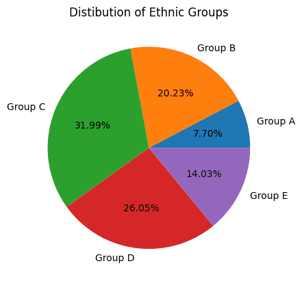
Bar plots, histograms, and pie charts were created using Matplotlib and Seaborn to showcase score distributions, average scores per subject, and the number of students within different performance bands (e.g., pass, fail, distinction).
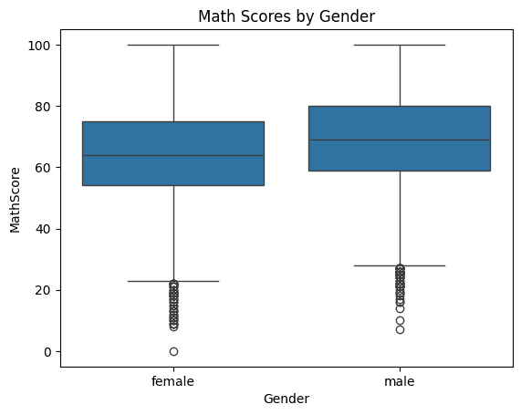
Box plots and violin plots were used to explore the variability in scores between different student groups.
Advanced Analysis:
Correlation analysis to identify the relationship between various subjects, and how improvement in one subject impacts others.
Actionable Insights:
Highlighted key areas where students are struggling the most.
Suggested strategies for improving overall student performance based on data trends and insights.
Tools Used:
Python
NumPy
Pandas
Matplotlib
Seaborn
Jupyter Notebook
VISUALIZATIONS
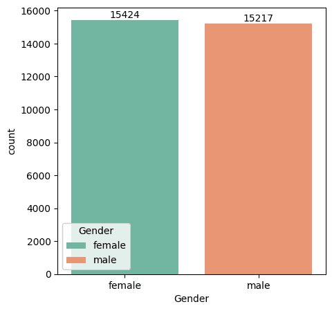
GENDER DISTIBUTION
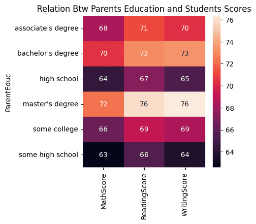
Relation Btw Parents Education and Students Scores
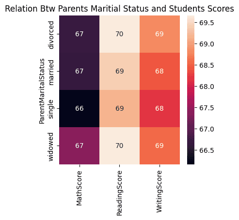
Relation Btw Parents Maritial Status and Students Scores
Distibution of Ethnic Groups
Math Scores by Gender
Key Takeaways: This project demonstrates how data analysis can be used to track and improve student performance. By understanding the data, educators can make informed decisions to adjust their teaching methods and provide targeted support to students in need.
GITHUB LINK::https://github.com/ibtihajjutt/Student-Exam-Score-Analysis-Python
The project's dashboard and visualizations offer an intuitive overview of student performance, making it easier for schools and educators to derive actionable insights from the data transform your healthcare web presence today.