This project focuses on analyzing sales data from Amazon using Python libraries such as NumPy, Pandas, Matplotlib, and Seaborn. The primary objective is to clean the data, perform exploratory data analysis (EDA), and generate meaningful insights through visualizations.
Project Overview
The dataset used for this project contains details about sales, sizes, categories, shipment statuses, fulfillment methods, and more. By cleaning the data and analyzing key features, the report highlights important trends and patterns related to Amazon sales.
Key Components of the Project
Data Understanding and Cleaning
The dataset is loaded using Pandas. Initial exploration includes viewing the structure, data types, and shape of the dataset to identify potential issues such as missing values and incorrect data types.
code
df = pd.read_csv("Amazon Sale Report.csv") print(df.head()) df.info()
Columns such as
"New"and"PendingS", which contain many null values, are dropped.pythonCopy code
df = df.drop(["New", "PendingS"], axis=1) df.info()Missing values in columns like
'fulfilled-by'are filled with the default value'Easy Ship'.df.fillna({'fulfilled-by': 'Easy Ship'}, inplace=True)Further handling includes converting data types (e.g.,ship-postal-codeto integers andDateto datetime format), and dropping rows whereship-postal-codeis missing.
Exploratory Data Analysis (EDA)
Descriptive statistics provide insights into numerical and categorical data distributions.
code
df.describe() df.describe(include='object')
Visualizations are used extensively to understand relationships and trends in the data.
Visualizations

Size Analysis: A bar plot is used to visualize the most popular sizes purchased by customers. The analysis reveals that M-size is the most bought size.
code
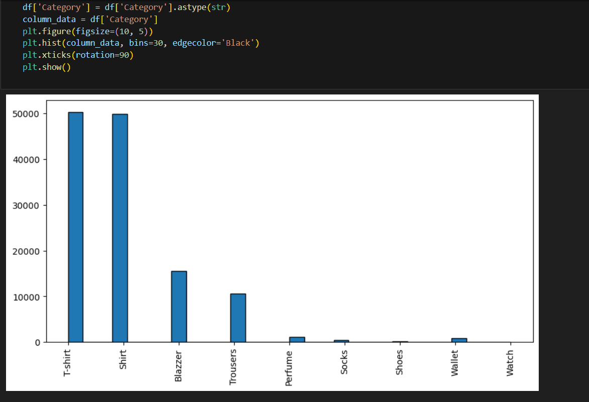
ax = sns.countplot(x='Size', data=df, hue='Size', palette='viridis') plt.show()Category Analysis: plotted to understand the distribution of product categories. The majority of buyers prefer T-shirts.
B2B Buyers: A pie chart is plotted to check the proportion of B2B buyers versus regular retail customers. The analysis shows that 99.3% of buyers are retailers.
code
B2B_Check = df['B2B'].value_counts() plt.pie(B2B_Check, labels=B2B_Check.index, autopct='%1.1f%%') plt.show()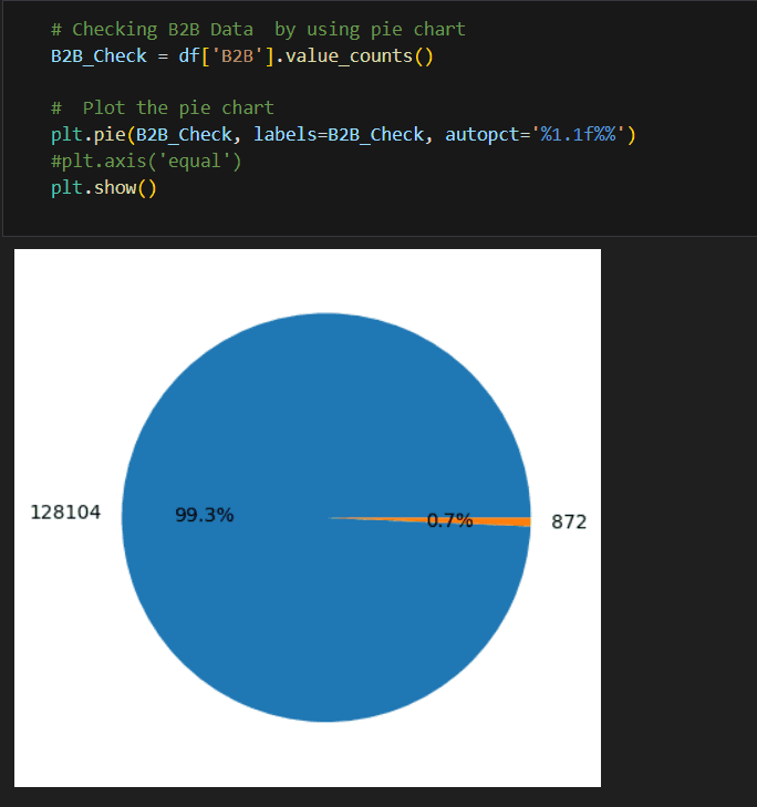
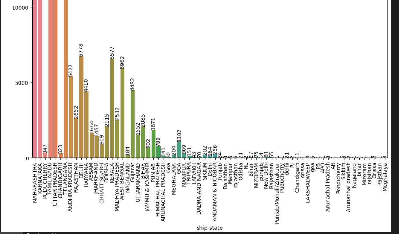
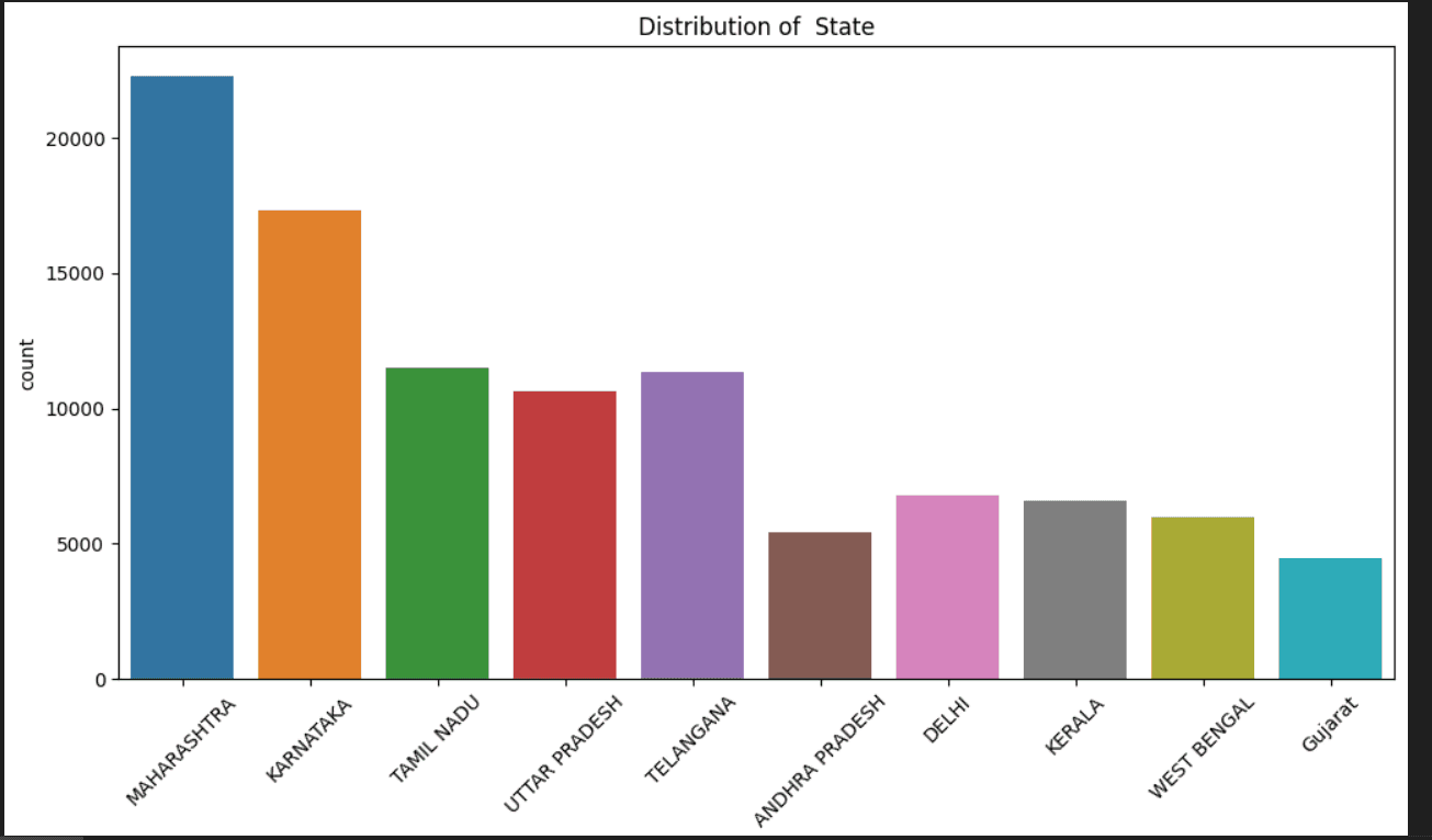
State Distribution: A bar plot shows the distribution of buyers across different states, with Maharashtra having the largest number of customers.
Copy code
sns.countplot(data=df, x='ship-state', palette='viridis') plt.xticks(rotation=90) plt.show()
Additional Insights
The analysis also includes a scatter plot to visualize the relationship between product categories and sizes.
# Prepare data for scatter plotx_data = df['Category'] y_data = df['Size']
# Plot the scatter plotplt.scatter(x_data, y_data)plt.xlabel('Category ') plt.ylabel('Size') plt.title('Scatter Plot') plt.show()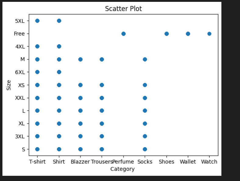
Another pie chart is used to analyze the fulfillment methods, revealing that most orders are fulfilled by Amazon.
# Prepare data for pie charta1 = df['Fulfilment'].value_counts()
# Step 4: Plot the pie chartfig, ax = plt.subplots()
ax.pie(a1, labels=a1.index, autopct='%1.1f%%', radius=0.7, wedgeprops=dict(width=0.6))ax.set(aspect="equal")
plt.show()

10 States by Buyers
The top 10 states with the most buyers are plotted, showing that Maharashtra has the highest customer base.
code
top_10_state = df['ship-state'].value_counts().head(10) sns.countplot(data=df[df['ship-state'].isin(top_10_state.index)], x='ship-state', palette='viridis') plt.xticks(rotation=45) plt.show()
GITHUB LINK:: https://github.com/ibtihajjutt/Amazon-Sales-Report-Analysis-Using-Python
Conclusion
The analysis of Amazon sales data reveals several key insights:
The data analysis reveals that the business has a significant customer base in Maharashtra state, mainly serves retailers, fulfills orders through Amazon, experiences high demand for T-shirts, and sees M-Size as the preferred choice among buyers.